
UX End-To-End:
Making and Keeping Resolutions
Project Overview
Each year, it’s common for people to make one or more New Year’s resolutions. At the same time, there also exists an idea that these resolutions fizzle out or are hard to stick with. My challenge was to explore solutions that would support someone defining and keeping up with their resolutions. The end result is a mobile app that will allow a user to choose and update one or more New Year’s resolutions, along with connecting with and growing their social circle. The goal is for the user to remain motivated and engaged with their resolution journey.
Role
UX Designer
Context
Conceptual capstone project for Springboard UI/UX Design Career Track bootcamp
Duration
3 months
Tools
Figma
Marvel
Adobe Illustrator
Discovery Phase
Step 1: User research
I initially performed some quick secondary research to get a high-level look at people’s thoughts around this topic. New Year’s resolutions appear to be a popular item annually, but the data shows that the spark fizzles rather quickly on average. Maintaining focus, momentum, and motivation look to be strong influences in failure. After developing a research plan, I performed the following:
Created a screener survey to find candidates to interview that align with my target user: those that are interested in self-improvement and goal setting.
Out of 25 people that completed the screener, 5 were selected and recruited for user interviews.
Created a discussion guide in preparation for user interviews.
Conducted 5 semi-structured 30-minute interviews, remotely and recorded.
“I try to make resolutions into something fluid, because sometimes things happen out of your control.”
“Having people understand your goal can help you navigate the hard times.”
“Mutual accountability helps.”
Step 2: Synthesis
I used several methods to synthesize my research, and several themes became apparent. Healthy habits such as exercising more and eating/drinking behaviors were common threads.
Thematic analysis via affinity map
Empathy map
Personas
JTBD (Jobs-to-be-done)
HMW (How Might We) statement
Affinity map with large focus on healthier living
Empathy map
Personas
JTBD:
Main Job: Maintain enthusiasm to keep a resolution
Related Job: Establish achievable goals
Emotional Job: Feel inspired to remain engaged
Social Job: Share progress with support network
HMW Statements:
How might we motivate people to continue their New Year’s resolution journey?
How might we help people to define and set goalposts for their New Year’s resolutions?
How might we keep people on track of their goals?
How might we enable people to monitor and measure progress towards a goal?
How might we elevate people from discouragement if they fail at a task?
How might we harness emotional support for someone?
Design Phase
Here, I started making design decisions and visualizing solutions based on what I learned during the discovery stage. I brainstormed solutions to the problem I was trying to solve based on my research and HMW statements I had developed previously. To get ideation started, I wrote user stories that I then prioritized to focus on for my MVP (Minimum Viable Product).
User stories captured the intent of the personas they are based on.
Step 1: Information Architecture
I explored app navigation and user flows, focusing on two primary “red routes”:
Choose one resolution, and update progress
Engage with social network and “add a friend” to join the platform
Initial app map
Red route user flows
Step 2: Sketching & Guerilla Usability Testing
Here, I engage in a series of sketching exercises for the mobile platform in order to quickly visualize ideas and functions. For testing purposes, I built a simple paper prototype and approached another 5 target users to work through my red route tasks. User tests were done both virtually and in person. The guerilla testing offered some good early insights that helped streamline tasks and make features more intuitive, allowing me to make adjustments in my approach for the next step.
Step 3: Paper to Digital
I incorporated learnings from my user tests and iterated on my designs as I transitioned into digital wireframes, and explored solutions for potential edge cases. I began considering transitions between screens here, and created wireflows to illustrate user interactions.
Low fidelity wireflows
Step 4: Design System and Brand Platform
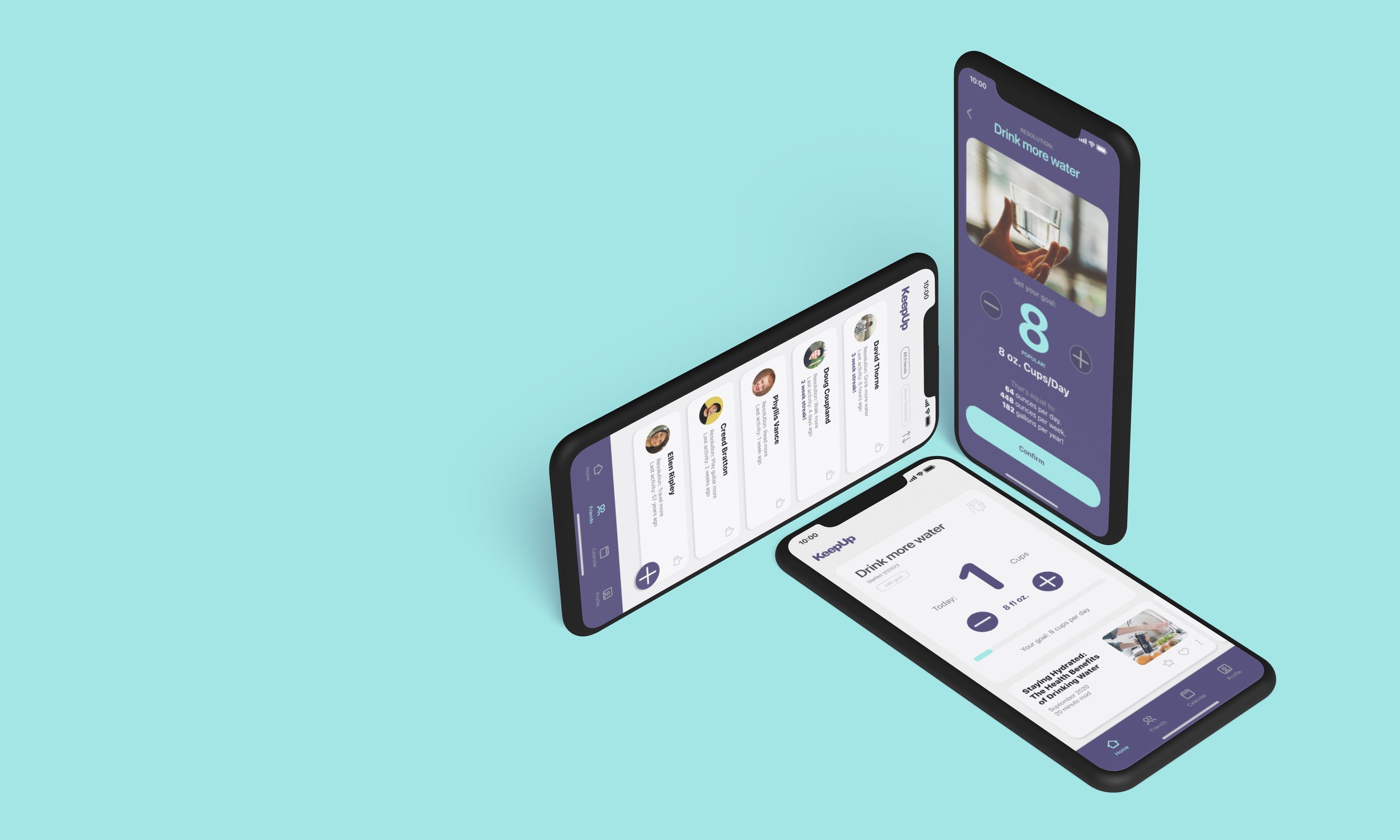
With this step, I created a lightweight brand platform and began to develop a logo. I settled at this point on a name for the app, “KeepUp” which is intended to be a short and snappy name that communicates the app's focus on helping users stay committed to their goals and keep up with their progress.
Mission/Vision
Every year, people choose to make New Year’s Resolutions to break a bad habit or encourage a healthy new one. This app aims to help those people define their goals, track them, and get the support and motivation they need to succeed.
Brand Personality
This app should go beyond a mere number tracker, and be a friendly voice.
Brand Attributes
Fun, warm, simple, supportive.
Step 5: Style Guide
Along with understanding the brand platform, selecting color, iconography, photography and other brand elements allowed me to develop a high-level visual guide for this project. This positioned me to create a consistent product.
Step 6: High Fidelity Mockups
Granularity was in focus when creating these near-final versions of my design. While building these screens, accessibility was checked to ensure inclusive design. I made decisions on when and where to use any drop shadows, particular line widths and other details that would support the UI and stay on brand.
Step 7: Prototyping and Animations
At this moment, I began to take my high fidelity screens and create a clickable prototype in Figma, crafting a memorable experience for the user. I focused on interaction patterns that ultimately affected functionality, brand personality, and user delight.
Validate Phase
Similar to my primary research, I first wrote a usability test plan to gain feedback for this project and then performed the following:
Recruited 5 users to participate in 30-minute, moderated usability tests over Zoom with screen sharing. Participants were sourced from friends, family, and other bootcamp students.
Users were asked to complete 2 tasks that aligned with my red route user flows: choose a resolution and update progress, and add a friend to the platform.
I took notes and then created a usability test report.
Leveraging test report notes and insights, I edited the screens and interactions further to increase the success of task completion.
I conducted another round of usability tests with 5 new participants, again gathering notes toward future refinement.
What I learned
This was an interesting project with a lot of new ground and new concepts to understand. An end-to-end product design experience was a first for me. I learned the hard way that some design intuitions and assumptions I had up front didn’t translate in the first iterations of my design. Listening to what the users said during testing and interviews helped me design something simple that the user is more likely to continue using, with enough features and micro-transactions to keep them entertained.
For future steps, I would like to build out the social interaction aspect of the app further, as this was a big driver for users that I met with. I’ve touched on it lightly in the high-fidelity screens, but I’d like to further build out engaging with others by sending “high-fives” and digging into the accountability-partner aspect of goal setting. For data collection and goal updates, I’d like to consider how to sync with other tech, such as with a smart watch and step counting if that is the particular goal.
