
Design Sprint:
Helping the
at-home chef
Problem
Savr is a new startup that wants to make it easier for people to follow new recipes and cook great meals at home. However, users have been struggling to accurately, and easily follow a recipe’s cooking instructions.
Solution
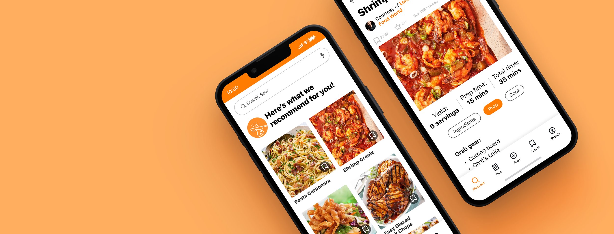
I elected to add a section to the existing app dedicated to prep work. “Mise en place” (everything in its place), as known in the culinary world, will help the cook position themselves to fully focus on the dish when it comes time to cook.
Role: UX Designer • Context: Conceptual, modified Google Ventures style design sprint, solo project
Duration: 1 week • Tools: Figma, Pen & Paper

Day 1: Understand
The Savr team provided research insights up front. This included notable user quotes, user interviews, and one persona. I was able to synthesize this research to help inform my design decisions.
“Sometimes I feel like steps are sprung on me … and that turns an enjoyable experience into a stressful one. I like to be as prepared as I possibly can before I start cooking things that I can’t undo.” —Anna
Research highlights
Users were not sure if they were on the “right track” during the cooking process.
Users did not want to feel surprised by steps or ingredients partway through the cooking process.
Improvement of the order of prepping and cooking steps was important to users for the sake of efficiency, using fewer cookware items, or washing cookware in between cooking steps.
Timing in general was a stressor and a concern.
Cooking steps need to be clear.
Some recipes require unfamiliar ingredients. Less common preparations or ingredients may benefit from a little extra explanation.
Based on the research, I chose to focus on prep work to solve the problem.
My reasoning
It may give the best chance of success to have all the prep work completed upfront prior to cooking. Overlapping cooking and prepping may be a time-saver when one is familiar with preparing a certain dish, but for first-time use of a recipe this may be problematic and is leading to a poor experience.
The goal
Help users accurately, and easily follow a recipe’s cooking instructions.
Constraints
Recipes are written in text, ordered from start to finish
Solution should be designed as a feature on the Savr native mobile app
Focus should be on better experience for users for when it’s time to cook
Day 2: Sketch
This day was spent with a lightning demo researching competing products, and ideating. While deciding on the most critical screen(s) to develop, I asked myself: Which screen is most important for solving this problem? Which screen is the most complex?
Sketching helped me decide on the most critical screen: prep work as its own section.
Day 3: Storyboarding
I decided that having everything prepared up front was very important to the success of the meal preparation. Even the smallest amount of an ingredient, pre-measured and isolated (like a tablespoon of sugar in its own small bowl), will free up the mental load and stress that may occur when trying to cook and prepare at the same time. It may take more time up front, but will pay off during the cooking process when the user is free to focus on cooking.
Sketching the user flow let me focus my time and prioritize interactions that might help the user.
Day 4: Prototyping
Building from scratch in an afternoon had me thinking about what to prioritize. The task at hand was to make the surrounding facade as believable as possible. Using Figma, I included several familiar elements such as icons to favorite and share, but functionality was kept to a bare minimum to keep the focus on successfully interacting with the section dedicated to prep.
A quickly built prototype allowed me to test my idea.
Day 5: Testing & Validating
I performed 5 usability tests by pulling from a pool of UX students and my own social circle, focusing on those that tend to cook and follow recipes. Tests were performed over Zoom with screen share, and in person using my phone running the Figma prototype.
Setup
I asked users to navigate to a recipe, and walk me through their thought process. “What would you do next?”
I observed their behaviors to see if users would find value in the dedicated prep section I had created.
I asked users to act as though they were actively prepping for a recipe, in order to see if they would complete the task as intended. If successful, the user would reach the “Let’s get cooking!” green button.
The prepping section came across as a valuable step to successfully complete a recipe.
Equipment is important
Most users liked the fact that there was a list of cooking equipment and tools included in the prep list. A common complaint was being surprised and scrambling halfway through cooking to get a needed item.
Step-by-step: Not that helpful
The pop-up card that I created was buried, and considered redundant for the most part. Users expected to either have an expanded explanation of the step itself, or the ability to swipe between steps at this stage. Most users were content with zooming in to the screen if they needed larger type.
Green is good
When all prep steps were complete and all check marks turned green, that signified to users that the “hard work was done.” Confidence was high that the user could start cooking with less worry.
Testing summary
Overall, tasks were completed successfully and the prepping section came across as a valuable step to successfully follow a recipe. I eventually needed to direct users to the step-by-step feature that I built, because during testing I realized that feature was buried and not apparent.
What I’d do next
I would further develop the step-by-step feature as I still think there could be some value there if properly executed, and this would require more testing. I’d like to incorporate detail photos for preparations that may be unfamiliar to users, and expanded information on techniques such as how to swiftly dice an onion. I would incorporate some onboarding early on in the app that speaks to these new features.
Conclusion
This was a great exercise to get a problem-solving idea developed in short order.
I did make some quick tweaks to the prototype after my first test. Some steps were clearly confusing and I realized they would be critical failures for the next testers. I initially forgot to add in the list of utensils and cookware needed to prep the dish, for example, which was my original intent.
Imperfect is acceptable here. I invested time to make the UI tight for presentation purposes, but I realize the point is to rapidly test an idea.